Live client product · Solo
GLP-1 Nutrition & Macro Tool
Eternal Health: From five numbers to a personalized10-page plan, in under two minutes.
A patient-led, mobile-first web app used in clinic. Patients enter five baseline biometrics, the browser calculates clinically grounded GLP-1 macro and hydration targets, and they leave with a 10-page PDF plan saved to their phone. It's fully stateless: zero PHI collected or stored.
- Role
- Lead Product Designer & Frontend Engineer (solo)
- Client
- Ida Redican, MSN, APRN, FNP-C · Eternal Health LLC
- Timeline
- Jul 15 – Aug 31, 2026 · 8 phases, all on time
- Stack
- React 19, Vite, TypeScript, Tailwind CSS v4, html2pdf.js / jsPDF, Vitest, Oxlint, Prettier, GitHub + Vercel
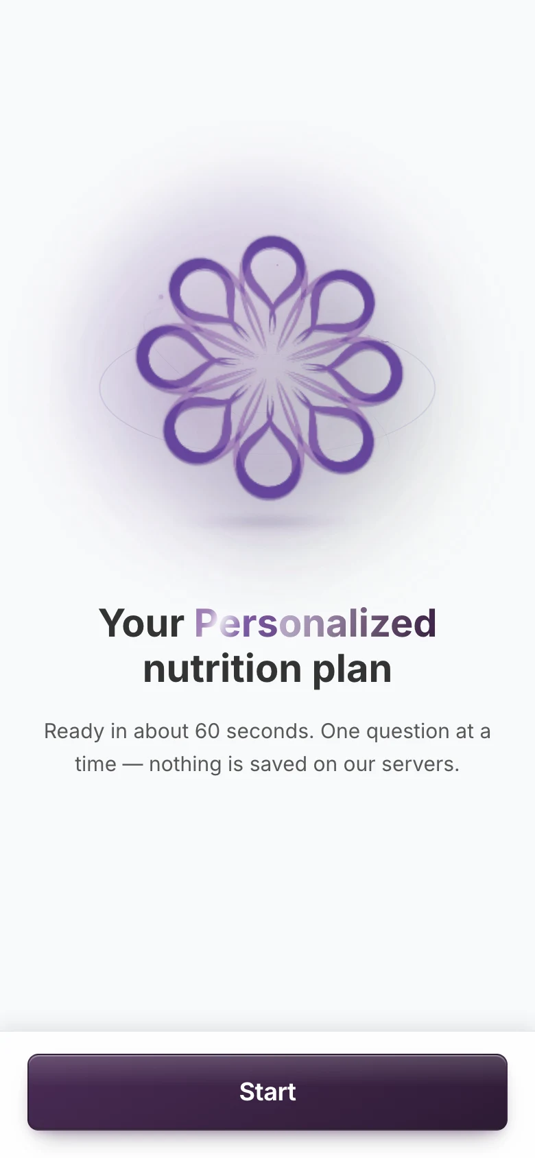
Welcome
Real screens from the live app, with demo answers.
Overview
At a glance
- Challenge
- A nurse practitioner was building GLP-1 nutrition plans by hand, assembling templates between consults in a tool with too many choices. Her rule: provider time spent on plans during visits had to drop to zero.
- What I built
- A patient-led, mobile-first web app. Patients scan a QR code in the clinic, answer one question per screen on their own phone, and leave with a personalized 10-page PDF. It runs entirely in the browser and stores nothing.
- Outcome
- Every target met in beta: unassisted intake in 1m 45s across 25 participants, 4.8/5 self-management confidence, 100% PDF export success across platforms, and zero provider time during visits.
- Role
- Lead Product Designer & Frontend Engineer
- Team
- Solo, design and engineering
- Audience
- GLP-1 patients, mostly women aged 35–50
- Timeline
- Jul 15 – Aug 31, 2026
The problem
What wasn't working
Ida Redican, MSN, APRN, FNP-C, builds nutrition plans for patients on GLP-1 medications (semaglutide and tirzepatide), most of them women between 35 and 50. Every plan meant working in a tool with too many choices and assembling templates by hand between consults.
She set one rule for the product, the Zero-Minute Mandate: provider time spent generating plans during visits had to drop to zero.
The mandate
The Zero-Minute Mandate: provider time spent generating plans during visits had to drop to zero.
From dashboard to patient-led
What contextual inquiry changed
I started with an admin dashboard. Contextual inquiry in the clinic showed the flaw: staff had no time to enter data. So I turned the product around. Patients scan a QR code in the clinic and answer one question per screen on their own phones.
The pivot: a patient-led flow
Patients answer on their own phone
- 01
Patient scans the QR code in the clinic
- 02
One question per screen, eight screens
- 03
The plan builds on the phone
- 04
Patient saves the PDF to their phone
Provider time spent on the plan
0m 00s
Privacy by architecture
Stateless, client-side, zero PHI
The app collects five numbers and a medication, does the math in the browser, and keeps nothing.
Calculated in the browser
Every calculation runs in memory on the patient's phone. Nothing is sent anywhere to be worked out.
No names, birth dates or PHI
The app asks for five baseline biometrics and a medication. It never asks who you are.
No database at all
With nothing stored, there was no HIPAA hosting to pay for, which kept the build within a small clinic's reach.
On Elite Exams, health information had to travel, so it went to a HIPAA-tier intake platform. Here the answer was the opposite: keep it from ever leaving the phone.
The clinic gate
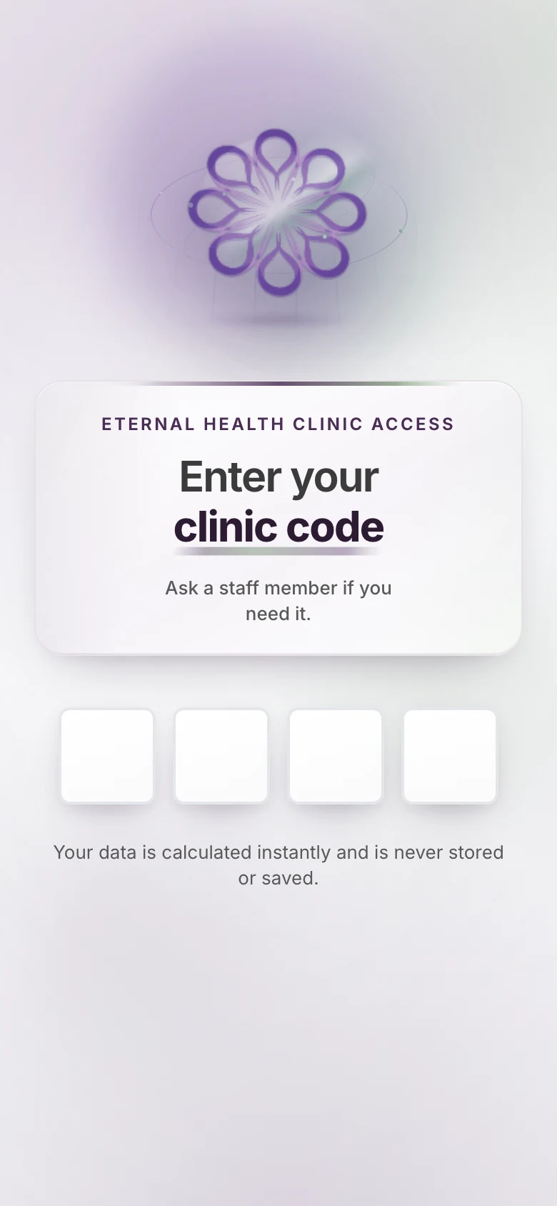
The clinic's formulas stay with the clinic
Patients get in by scanning a QR code on a standee in the clinic. If the scan doesn't work, they ask a staff member for the code and type it on a PIN keypad. Either way, the calculations stay gated to the clinic's patients.
Eight screens, one question each
Q1–Q8, built for thumbs
Each screen asks one thing, with the input that suits it. Custom keypads and wheels replace the system keyboard, and every target is at least 48 × 48 px.
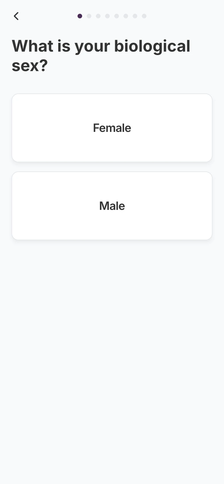
Q1 · Biological sex
Tap-to-advance cards
One tap answers and moves on. No Next button to find.
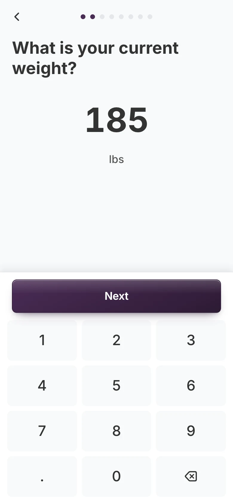
Q2 · Weight
Custom keypad
Accepts 80 to 600 lb. No system keyboard covering the question.
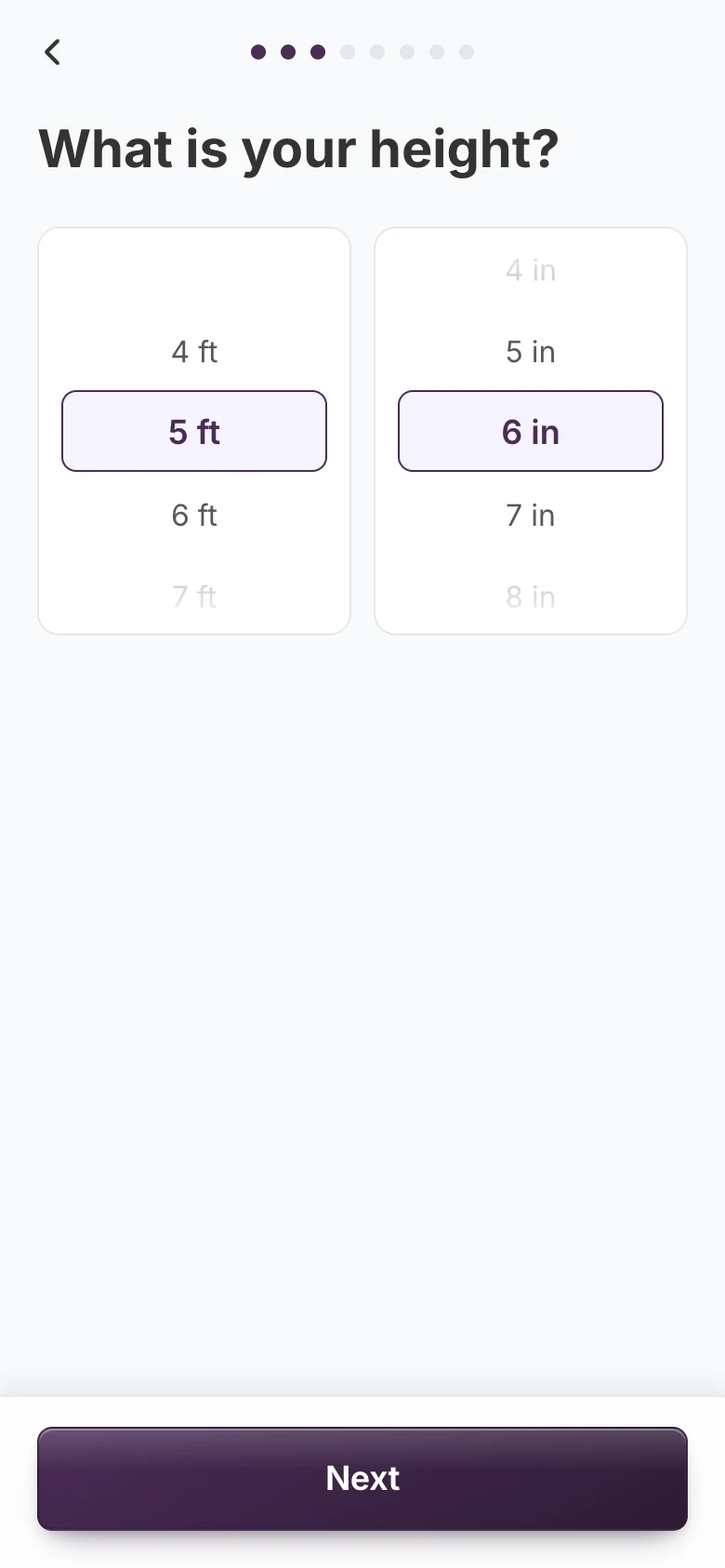
Q3 · Height
Scroll wheels
Feet and inches side by side, the way people say their height.
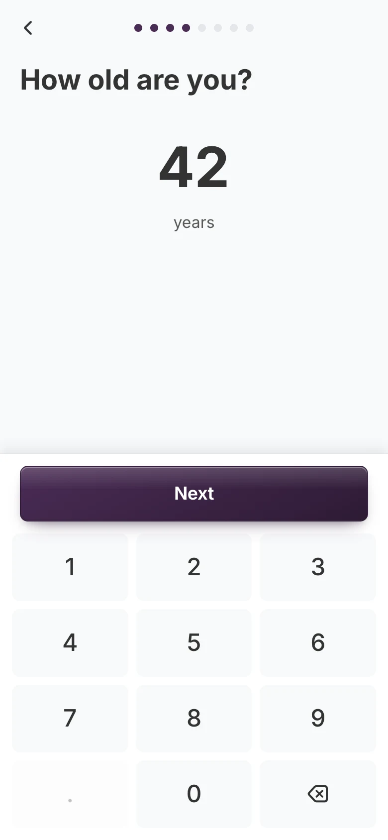
Q4 · Age
Custom keypad
The same keypad as weight, so there's nothing new to learn.
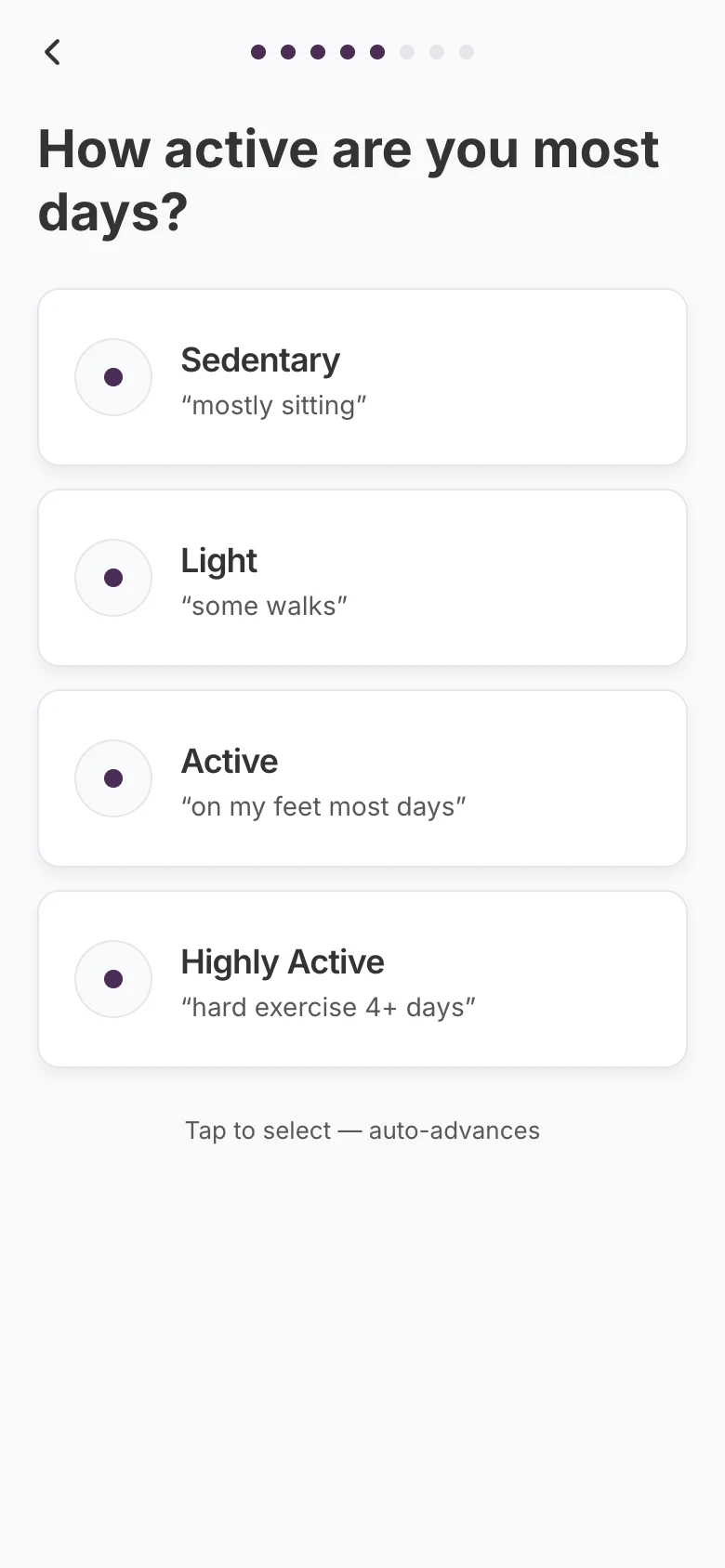
Q5 · Activity
Four visual cards
Each level has an everyday example, like 'some walks'.
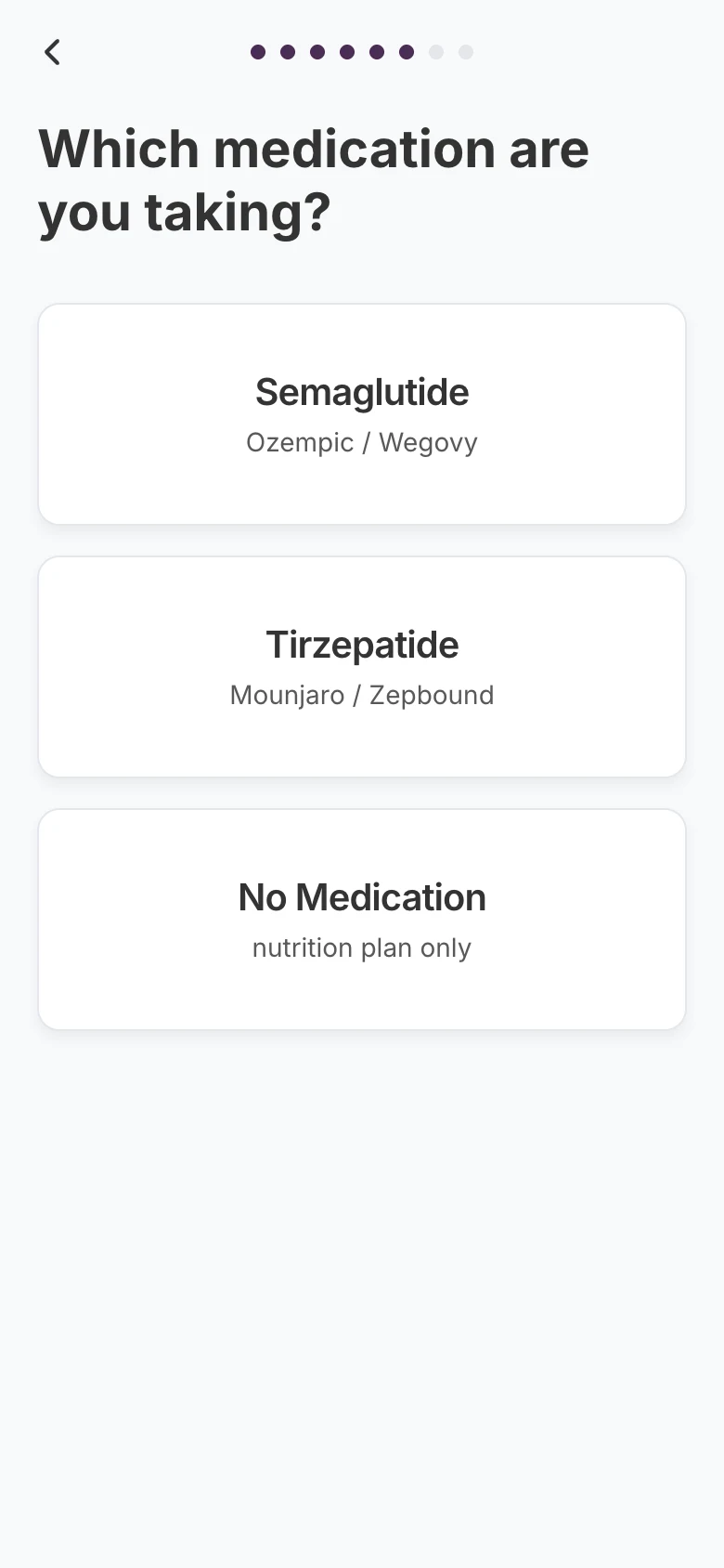
Q6 · Medication
Medication cards
Generic names first, with the brand names patients know underneath.
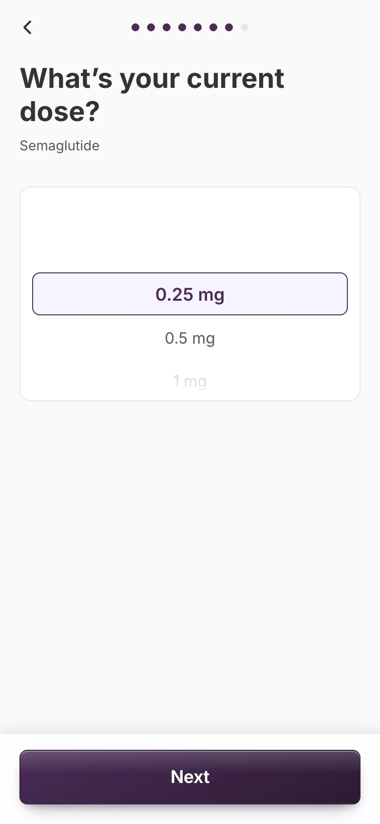
Q7 · Dose
Filtered wheel
Only shows doses for the medication picked on the screen before.
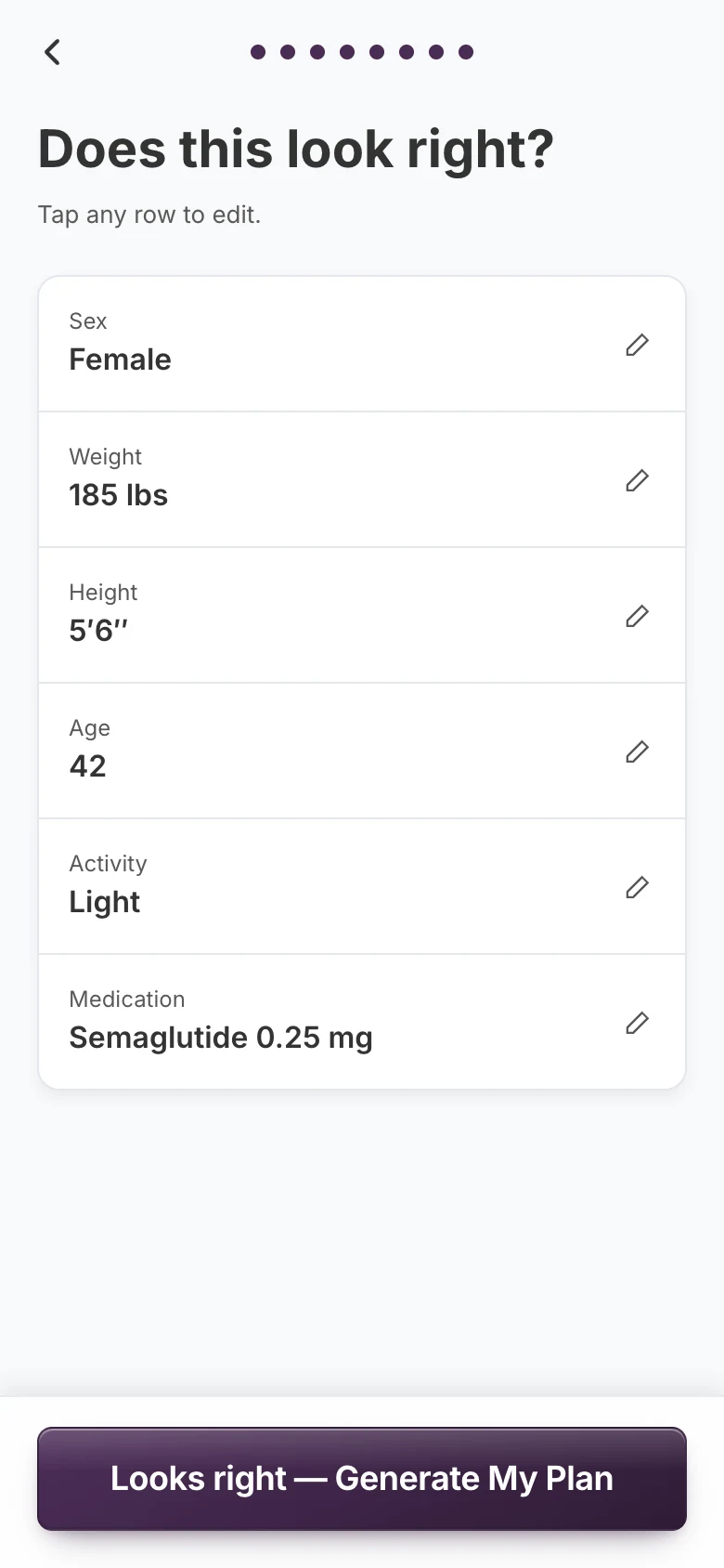
Q8 · Review
Tap-to-edit summary
Every answer on one screen. Tap a row to fix it.
The generation moment
A deliberate 1.5 seconds
Tapping “Generate My Plan” starts a 1.5-second pulsing skeleton. The math takes under 50ms; the pause is there for perceived credibility. Then the plan opens in a preview carousel, with Print, Save to Files and Email to Myself pinned below it.
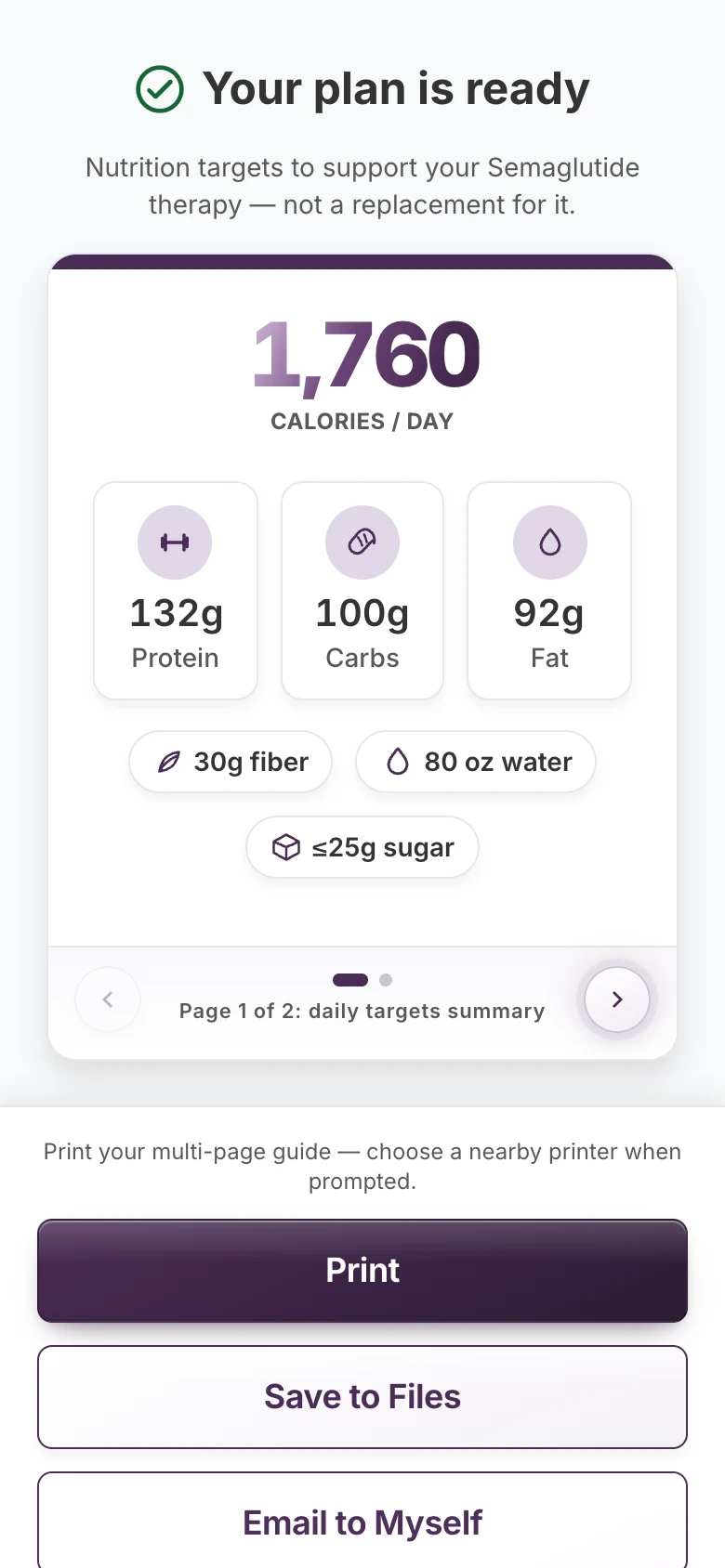
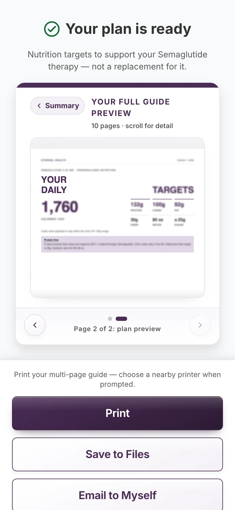
Then, three ways to keep it
- Save to Files
- Email to Myself
The actions stay pinned to the bottom of the screen while the patient swipes through a preview of their plan.
The calculation engine
Five inputs, seven targets, under 50ms
It starts from the Mifflin-St Jeor equation, then applies safety rails that keep every target within the clinic's limits. Unit tests in Vitest check the math's invariants.
5 inputs
- Sex
- Weight
- Height
- Age
- Activity
7 targets
- Calories
- Protein
- Fat
- Carbs
- Fiber
- Hydration
- Added-sugar ceiling
Safety rails
Calorie floors by sex
Targets never drop below a minimum.
Protein for lean mass
Set high enough to help protect lean mass.
A carb floor
Carbohydrates never fall below a set minimum.
A hydration floor
Water targets never fall below a minimum.
The clinic's exact values are gated in the product, so they're not published here.
Vitest · calculation invariants
Passing: macros sum to within 12 kcal of the calorie target
Worked benchmark
Published outputs for one benchmark profile. Inputs withheld.
1,782kcal / day
134×4 + 54×9 + 190×4 = 1,782 kcal100% of target
- 28g fiber
- 110 oz water
- ≤25g added sugar
The app supports a provider's prescribed GLP-1 care. It isn't medical advice, and neither is this case study.
The 10-page plan
What patients take home
A personalized PDF saved to the patient's phone: their targets first, then the guidance that helps them follow through.
- Eternal Health01 / 10
Personalized nutrition
Your daily
targetsCalories, protein, carbs, fat, fiber, water and sugar
- Eternal Health02 / 10
Food guide
Eat well,
track with careFood and grocery guide
- Eternal Health03 / 10
Adherence & comfort
For GLP-1
patientsHydration, sleep and meal sizing
- Eternal Health04 / 10
Movement
Exercise
instructionsResistance training
- Eternal Health05 / 10
Measuring without tools
Portion
sizeThe hand method
- Eternal Health06 / 10
GLP-1 side effects
The
3 P’sSide-effect guidance that supports prescribed therapy
- Eternal Health07 / 10
Storage
How to
storeKeeping medication potent and safe
- Eternal Health08 / 10
Injection guide
Prepare
& injectInjection sites and technique
- Eternal Health09 / 10
Mindset & math
Education
highlightsPatient education
- Eternal Health10 / 10
Clinical use
Safety
& legalSafety and legal information
Titles only. The plan's content belongs to the clinic.
Design system & accessibility
WCAG 2.1 AA, in a quiet-luxury register
Deep purple carries emphasis and the big numbers, lavender softens surfaces, and Forest Green appears only when something is valid or done. Every text pair passes AA, focus rings are 3px purple, and every target is at least 48 × 48 px.
- Deep Purple#4A2C55
Primary actions, emphasis and the big numbers.
White on it 11.8:1 · AAA
- Midnight Purple#331D3B
Pressed states.
White on it 15.2:1 · AAA
- Soft Lavender#E0D6E6
Soft surfaces and icon wells.
Deep Purple on it 8.4:1 · AAA
- Forest Green#166534
Validation and success, nothing else.
On white 7.1:1 · AAA
- App Gray#F8F9FA
The app background.
Charcoal on it 12.0:1 · AAA
- White#FFFFFF
Cards and inputs.
Charcoal on it 12.6:1 · AAA
- Charcoal#333333
Primary text.
On white 12.6:1 · AAA
- Medium Gray#595959
Secondary text.
On white 7.0:1 · AAA, on lavender 5.0:1 · AA
Type · Inter Variable and Roboto Flex
Questions28px
What is your current weight?
Hero numbers56px
1,782
Buttons18–20px
Generate My PlanBody16px
One question at a time — nothing is saved on our servers.
Touch targets
Try it · the weight keypad
Every key clears 48 × 48 px.
lbs
✓ 185 lb is in range
The dashed squares are 48 × 48 px, the minimum for every target in the app. The Elite Exams site sets its floor at 44 px; this app sets it at 48 px.
Motion
Same step, two motion settings
What is your current weight?
Standard · 250ms slide
What is your current weight?
Reduced motion · 150ms crossfade
Custom icon set
 Water
Water Movement
 Palm
Palm Fist
Fist Thumb
Thumb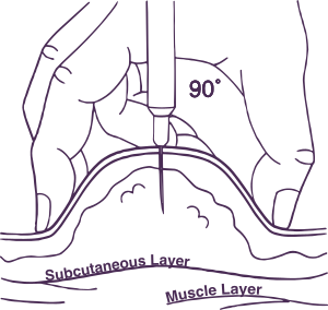 Subcutaneous injection
Drawn in Illustrator for the plan. Normalizing the SVG viewBoxes fixed clipping on iOS.
An AI-augmented pipeline
How one person covered research, design and engineering
Each tool had a specific job. The decisions stayed mine.
- 1
NotebookLM
Clinical ground truth: trial data and the clinic's guides, in one place.
- 2
Gemini Deep Research
The premium mobile UX research brief, plus a second check on the math and contrast.
- 3
FigJam
The information architecture.
- 4
Cursor (MCP)
Read the FigJam board over MCP to generate the Figma frames. Also my main IDE, with a canvas preview for iterating on the PDF.
- 5
Figma
375px mobile frames, generated from the IA.
- 6
Claude
Type-safe calculation invariants, the state machine, and fixes for WebKit canvas clipping.
- 7
Vercel
Hosting, deployed from GitHub.
Alongside: brand assets
Illustrator
The custom medical SVG icons. Normalized viewBoxes fixed clipping on iOS.
Photoshop
QR standees and posters for the clinic.
Usability testing & results
Every target met in beta
Self-management confidence
4.8/ 5.0
Target metUnassisted intake time
1m 45s
Target metAcross 25 beta participantsCross-platform PDF export success
100%
- iOS Safari
- Android Chrome
- WebKit
Provider time during visits
0m 00s
The Zero-Minute Mandate, met. Patients build their plans on their own.
Key iterations
What changed along the way
Before: A playful mascot
After: Quiet-luxury clinical authority
The mascot came out. Calm type, deep purple and generous space carry the brand instead.
Before: Save without a preview
After: A preview carousel first
Patients swipe through their plan before they save or email it.
Before: Nutrition guidance only
After: Sleep and recovery added
The plan now covers sleep and recovery alongside food, water and movement.
Before: Side-effect tips on their own
After: Framed around prescribed care
All side-effect guidance supports the patient's prescribed GLP-1 therapy. It never replaces it.
Shipped on time
Eight phases, Jul 15 to Aug 31
Core engineering finished in week 2. That left a five-week runway for cross-device QA and clinical sign-off.
Weeks 1–2
Discovery & IA through core engineering
Weeks 3–7 · the runway
Cross-device QA and clinical sign-off, then launch
8 phases, all delivered on time
Retrospective
Looking back
The Zero-Minute Mandate was met: patients build their own plans, and provider time during visits is zero. The two decisions that made it work both removed something: the staff's data entry, and the patient data itself.
What made it work
- 01Contextual inquiry before features. Seeing that staff had no time to enter data turned an admin dashboard into a patient-led flow.
- 02Privacy as architecture. Going stateless removed the need for HIPAA hosting and kept the build within a small clinic's reach.
- 03Engineering early, testing long. Finishing core engineering in week 2 left five weeks for cross-device QA and clinical sign-off.
Constraints that shaped the design
- The Zero-Minute Mandate: no provider time on plans during visits.
- No PHI: no names, no birth dates, no database.
- The clinic's formulas stay gated behind a QR code and a PIN.
- PDF export had to work on iOS Safari, Android Chrome and WebKit.
- All guidance supports prescribed GLP-1 therapy and never replaces it.